


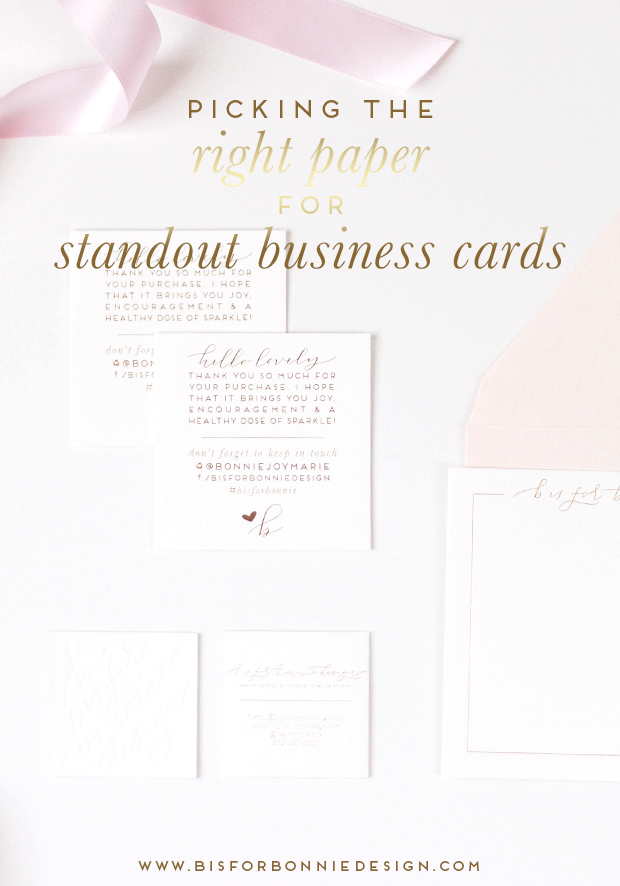
Aside from designing logos for my sweet branding clients, my favorite part of any custom branding project has to be the print collateral. From business cards, to branded stationery, to creative order inserts that make a lasting impressive, I love it all! But nothing can impede the effectiveness of strong print collateral quite like the wrong paper. Think of it this way – your business card is often one of the first tangible impressions, or touch points, a potential client or colleague receives. You want to be presenting your brand in the best possible light, and choices as seemingly miniscule as picking out the perfect paper for your business cards truly carry a great deal of weight. But don’t worry! Selecting the kind of paper that will not only make your business card design shine, but will also serve as an authentic touch point for your brand, is much easier than you think.
Before we get too caught up with all the paper options out there, let’s approach this decision strategically. Consider your brand, what experience you want to convey to your ideal client, and your budget. Is your brand feminine and whimsical? Organic and approachable? Chic and luxury-oriented? What message do you want this piece of collateral to convey? Hopefully, the combination of your print design and the perfect paper culminate into a touch point that accurately portrays your brand’s mission and aesthetic. Lastly, let’s not forget about budgeting! If you’re wanting to print 500 business cards for $150, that’s going to affect the printing methods and paper options you can utilize.
From there, let’s consider what type of printing and finishing methods you have your heart set on. The types of paper used for letterpress or foil stamping are quite different from those used for full color, digital designs. If your card design is graphics-heavy and utilizes vibrant hues throughout, then digital printing will bring that design to life beautifully. For minimal, typography-based designs, foil stamping, embossing or letterpress are clever ways to make a statement.
I often recommend thicker paper weights and subtle finishes to my clients in order to bring their business cards to life beautifully. Especially if you’re printing a double-sided design, you’ll want to ensure the paper weight you’re using can hold the ink well and not bleed through. When picking the right paper, pay close attention to paper weight and finish. Paper weight correlates to the thickness of the paper, with smaller weights being traditionally thinner and more flimsy to the touch. Thicker paper types offer a more substantial impression, and can stand up to heavier printing methods like letterpress or color-heavy printing.
Paper finishes refer to the texture of the stock itself, which is on par with the importance of paper weights. Glossy stock works well for printing photographs or graphics-heavy designs. Matte finishes are smooth to the touch, but lack the sheen of a glossy card. I personally prefer matte finishes for full-color designs, as they have clean, modern look about them. Crane Lettra, or a similarly thick, absorbent stock, is often used for letterpress or foil stamping work. Just like there are hundreds of shades of white, there are an incredible number of finishes that range from smooth as can be to incredibly textured and absorbent!
As you’re considering different paper types for your beautiful business cards, remember that your personal preferences makes a huge difference. If you prefer to look and feel of a thick, cotton-based paper as opposed to a thin, glossy stock, then pay attention to that preference! You’re the one who will be handing out these cards and enjoying them every day, so be sure you’re pleased with your choice before investing in, say, 1,000 new cards. Keep in mind that many print shops offer paper samples, even online printers. Do yourself a favor and order some samples before making the final decision, so you can experience the texture options, weights and colors for yourself.


leave a comment