


Earlier this week, I dished on how to create your brand’s color palette, breaking down some of the basics of color theory to set you and your visual brand up for success! But today, I want to dive even deeper into how color plays a strategic role in your visual brand and how it can help you intentionally inspire the best perception of the heart behind your work. So let’s explore the nitty gritty of the psychology of color, shall we?

First of all, I think it’s important to clarify when we talk about the psychology of color, we’re exploring the overall perception that consumers have in association with these colors. It’s a common misconception that color is universally experienced the same way by all viewers. But realistically, every individual brings a different experience, worldview, set of values, and more to the table! So there’s no way to universally categorize the way people feel whenever they look at a specific color. So, for this conversation we’re going to be studying how color within visual branding affects perception.
When you’re exploring the different color options to incorporate into your brand’s primary color palette, it’s important to consider how those colors represent the personality of your brand, and how they can be perceived by your ideal client.
Like I mentioned yesterday, the strategic use of color can reinforce your brand’s personality, aesthetic, and experience to your ideal client. When you’re thinking about what colors to use as you create your brand’s color palette, it’s important to think about how you want people to feel whenever they come across your brand. Based on that desired emotional response, you can make a more informed decision about the type of colors you should weave throughout your visuals.
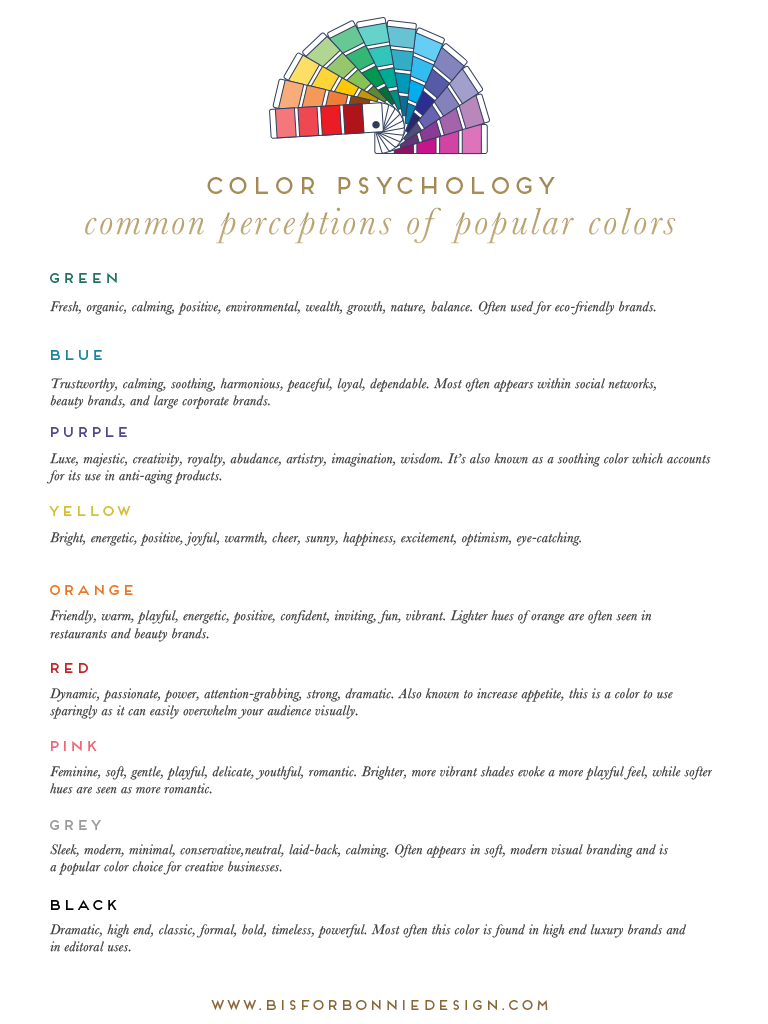
Below, I’m sharing a quick graphic that outlines popular colors used in visual branding and how they’re commonly (not universally!) perceived by others. But, when choosing the right colors for your brand, don’t forget to ask yourself how those choices reinforce the overall brand you’re trying to convey.
When you select colors to use for your visual branding, are you consciously considering how those specific hues are being perceived or interpreted by your ideal client? I hope this challenges you to think about how you can truly be intentional in every touchpoint of your brand’s visual presence.
If you’re ready to partner with a professional brand designer and strategist to help you not only create your most strategic color palette, but also your most purposeful and profitable visual brand, I’d love to chat with you! 2017 design dates are filling up quickly, so get in touch via the contact page to schedule a complimentary consultation.


This was a great post, friend! One thing I always struggle with in the rebranding process is what color to use. I would’ve never even considered yellow until I read this! Such helpful information!
India | @booksandbighair
So glad to hear this post was helpful! And I love that now you’re thinking of how different colors can better help tell your story well. Hooray!